this chart is really enlightening to showcase to people how the uk is a “two-speed” economy, where london and south-east england basically hog all the resources, and how actually, it’s (in my belief) the underlying factor for why the brexit vote went the way it did
i.e, most places in the uk are at the bottom of the pack of european cities, yet as a whole, were still expected to be the 2nd biggest contributors to the eu, and pony up funds to cities higher on this list
this inequality might be the reason some voters were very, very salty when being pleaded to vote to remain in the eu
i know in practice, the contributions are chump change when compared to national budgets, but it provided a rare source of objective, indisputable ammo that was used to nudge the needle towards leaving. it was absolute loggerheads to try and explain to anyone why i could be okay with “my taxes in birmingham being siphoned off to budapest”

note: this data is from 2015
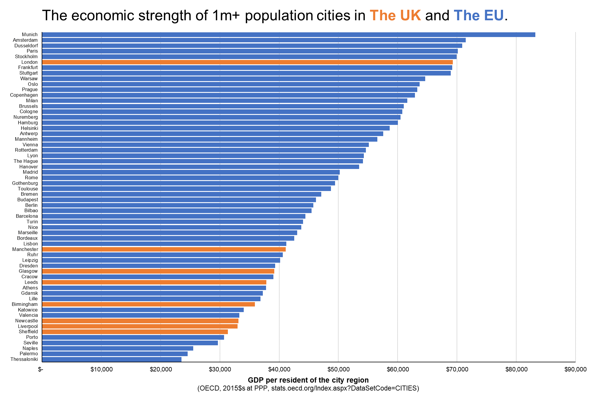
this chart is really enlightening to showcase to people how the uk is a “two-speed” economy, where london and south-east england basically hog all the resources, and how actually, it’s (in my belief) the underlying factor for why the brexit vote went the way it did
i.e, most places in the uk are at the bottom of the pack of european cities, yet as a whole, were still expected to be the 2nd biggest contributors to the eu, and pony up funds to cities higher on this list
this inequality might be the reason some voters were very, very salty when being pleaded to vote to remain in the eu
i know in practice, the contributions are chump change when compared to national budgets, but it provided a rare source of objective, indisputable ammo that was used to nudge the needle towards leaving. it was absolute loggerheads to try and explain to anyone why i could be okay with “my taxes in birmingham being siphoned off to budapest”
(for avoidance of doubt, i voted remain)