
Hello everyone,
This community is only a few hours old, and already there is a meta post ha ha.
I was just thinking that the EU flag doesn’t include non-EU countries such as Switzerland, the UK, Norway, Ukraine, Iceland, Albania, Georgia, etc.
Maybe a more “map-based” logo like this one could be considered too?

You’re right but the flag is easy to read even at low resolution. Not sure that a map would make for a good small icon.
Even in all black, it’s kind of hard to see at low resolutions (ignore the superimposed flag, this is just what I found on the internet):
Thank you for your comment!
As a comparison, the way !yurop@lemm.ee icon looks: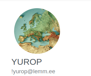
I guess the shape of the continent is unique enough to be distinguishable
This is what that looks like in Photon (e.g. at https://p.feddit.org):
And in the bottom bar, next to each other:
(Granted, it’s a little unfair, since Photon in particular appears to scale the icons in a dumb way.)
Seems reasonable on desktop, people are usually not having to look at the icon so much, they just want a way to quickly identify which community it is
Mobile might be another story
What’s dumb about the scaling? The resolution? if so, I’ll fix that.
Ooh, thank you! Sorry for the way I worded it. Anyway: To me, it looks weirdly pixelated, as if either:
It doesn’t take into account high-PPI screens and scales the image file for a 96ppi screen and then the browser scales it up to display size or
It just takes a file with huge image resolution and the browser scales it down quickly on the fly.
You can look at my screenshots.
I’ll try and fix that soon.