- cross-posted to:
- movies@lemmy.world
- cross-posted to:
- movies@lemmy.world
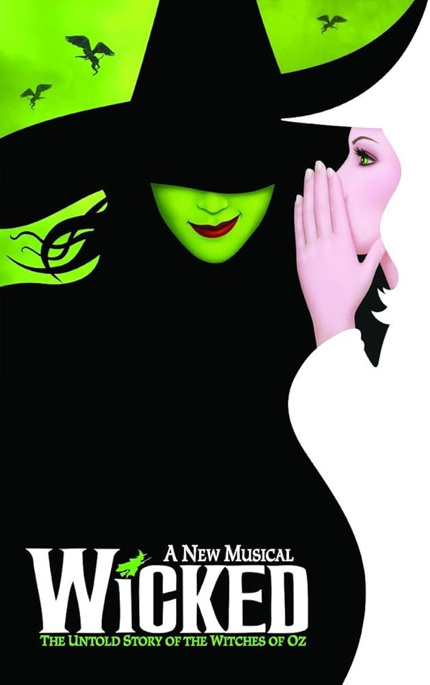
Fans customized the Wicked movie poster to more closely match the original Broadway poster.
Original Broadway Poster:
Movie poster:
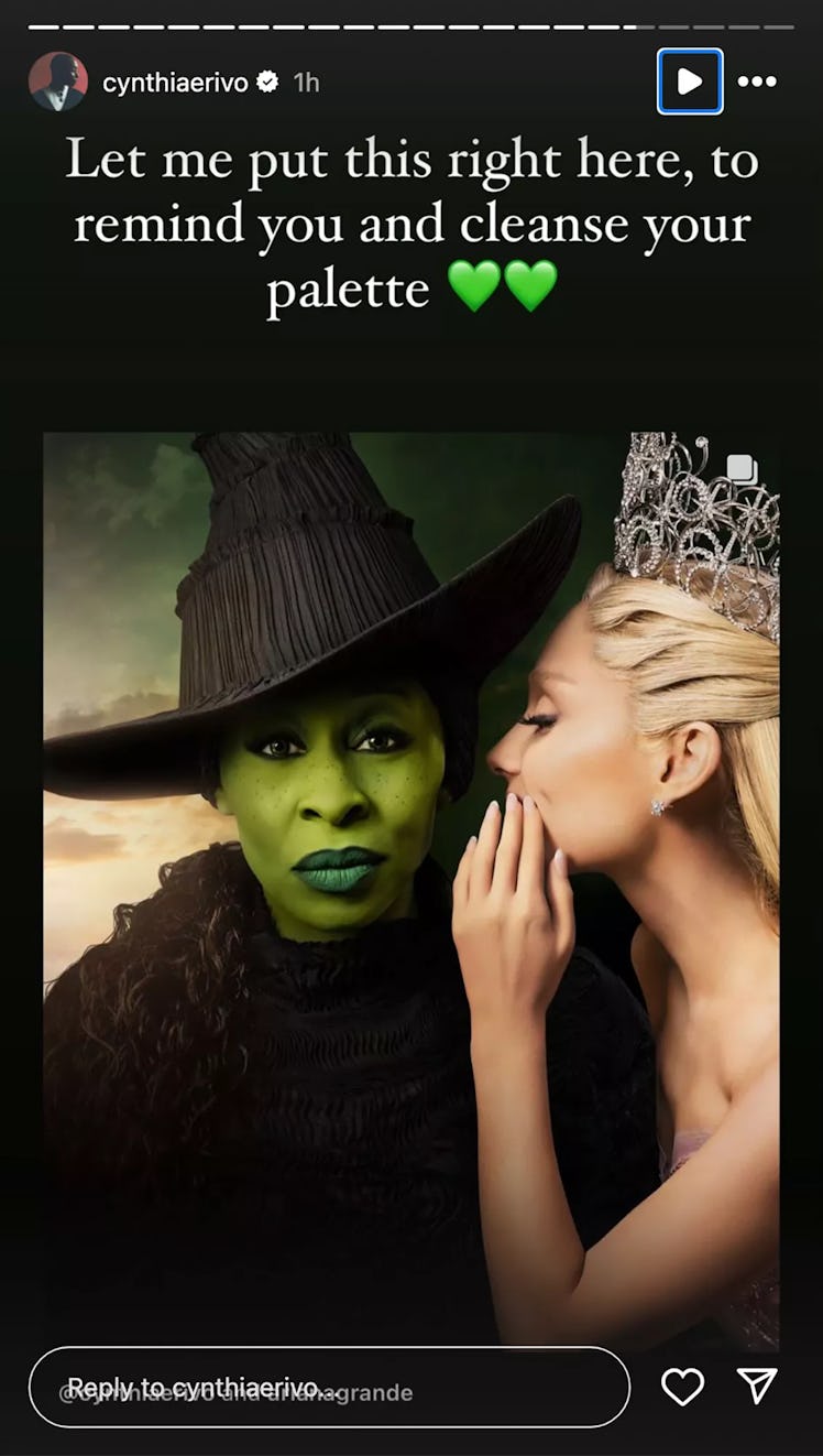
Some fans, disappointed by the poster, altered it to be closer to the original, moving Grande’s hand and lowering the brim of Erivo’s hat to cover her eyes. The edits prompted Erivo to respond. “This is the wildest, most offensive thing I have seen
“None of this is funny. None of it is cute. It degrades me. It degrades us,” Erivo continued. “The original poster is an ILLUSTRATION. I am a real life human being, who chose to look right down the barrel of the camera to you, the viewer… because, without words we communicate with our eyes.”
So, this seems like a completely reasonable reaction to fans making fan content.
If it was her decision that her full face should be on display, the backlash should be evidence enough that someone else gets paid to make those decisions, not her.
The original looks boring. She has absolutely no emotions on her face. There’s no mystique, no ‘wickedness’. Even the composition looks like something a high schooler in Photoshop class would make.
The edit isn’t perfect either. But at least it pays homage to the original in more than just image. It adds that mystique back, and makes her look more menacing.
What it truly boils down to is ego. Although the edit is better, and so many people agree on it, it doesn’t show her full face. And she can’t let that go.
Guaranteed this whole thing came up before that it didn’t match the style. She showed her cards and now makes it sound like she was the one who pushed against matching the original. Now that the fans see it and dislike it (probably like they warned that fans would), she’s mad about it. It really sounds like she pushed for this design so it wouldn’t hide her face and now she’s furious that fans reacted in the exact way that was predicted.
The edit looks ridiculous, how is it better?
I’m not mixing this up right?
The first picture with the red lipstick is the fan made photo?
where you can’t see half her face?
that is fucking weird.
The original looks so much better.
what are you talking about there’s no emotions on her face?
in the fan edit they took away half her face!
this is crazy that people like the fan edit, It’s like if you cut an origami crane in half, drew a smiley face on it with a Sharpie and you were like “yeah that’s better.”
The original’s smile communicates much more stuff than the eyes on the face that looks like it’s completely bored.
Trying to “communicate with her eyes” is exactly what makes the poster bad.
i disagree, but your interpretation of her eyes is your own and completely beside the point, in any case.
It’s not besides the point. It’s in fact the whole point. That’s why there is a fan edit and a response and a backlash to the backlash.
All of this is the point here. You can’t handwave away the other side cause you don’t agree or want to handle that argument.
Her eyes look bored and like she’s trying to look serious. Like she’s worried you realized you can smell her last fart.
“All of this is the point here.”
no, unless you are responding to somebody else, you are barking up a tree in a completely separate field.
“You can’t handwave away the other side cause you don’t agree or want to handle that argument.”
I’ve swatted every insult and argument here so far without breaking a sweat because they have no standing or, like your comments, are completely irrelevant to my comments, what you might want to try reading before responding to.
what you think of her expression is completely immaterial and irrelevant to any of my comments.
maybe you think you’re responding to somebody else?
you can think anything you like about her expression. whatever you like; it sounds like you like farts, so you’re thinking about farts.
That’s fine, and is completely irrelevant with respect to invalidating her own feelings of erasure.
that is what I have been addressing, and what most of you have completely whiffed on or shamefully been attacking her for.
I don’t care how people see the poster, I care that people are not respecting her feelings at being erased from her own artwork.
it doesn’t matter what you think of the artwork in the slightest.
it matters that you’re disrespecting someone for expressing themselves, bullying someone because they are being sincere.
you’re dehumanizing them because what they say makes you uncomfortable.
Her own artwork…. Movies are collaborations. She it a tiny but important part of the artwork not the entirety. Shit she’s like the sixth person playing the role. She created not much.
“She it a tiny but important part of the artwork…”
yes. and look how furious and contemptuous it has still made you that she has an opinion about her own work.
you claim she’s so unimportant, so why is it that she deserves so much contempt and abuse from a dozen strangers in one post simply for expressing her opinion, without demanding change or attacking anyone.
Wow. Ok.
You know you can make something and it still be bad right?
what do you need help with understanding here?
you need an example of someone that made “bad” art, you mean?
what does her expression tell you about her character?
ooh good question.
she has a very deliberate stare and a relaxed face, so it looks like she’s hearing something she doesn’t like that concerns her and she’s deciding what to do about it.
I also see something vulnerable in there, since the muscles around her eyes aren’t very tense, but still a very earnest look.
hoping for understanding, with a little resignation to do what must be done.
she’s nailing it with respect to her role, now that you bring it up.
you described almost every “resting face”.
I thought the resting face was supposed to be aggressive or bitchy?
she doesn’t really have those qualities in this expression.
That was never the point. I’m not commenting on if it’s better or not. Her reaction to something a fan made is what we’re all talking about.
The ego and vanity is astounding. And the movie poster sucks because she’s looking straight at the camera.
And I’m 90% sure that originally they wanted to make it matches the original styling but she fought to keep her face fully visible. So that’s why she’s so irked that there’s a fan who made that edit and proved the people who suggested that in the first place right.
That’s quite the oversimplification of a real life human being, who chose to look right down the barrel of the camera to you, the viewer… because, without words we communicate with our eyes.
She makes no mention of the hand covering up the other actresses face either.
I keep staring at the original, trying to figure out what she’s trying to communicate. I’ve seen the Broadway musical. I know the story. The vacant expression just doesn’t fit. It doesn’t convey any emotion I associate with the character.
Imo the fan one is better. They should have done the red lipstick with a smirk rather than green and looking bored.
This is the wildest, most offensive thing I have seen
Congratulations I guess?
deleted by creator
Stolen from reddit
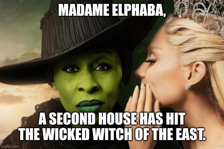
If that’s the most offensive thing they have seen they live a charmed life.
I could easily make it worse by simply copying and posting a cup onto the poster.
Yes, the Internet has broken me…
Bit of an overreaction if you ask me
Theatre kids gonna theatre
Putting it mildly.
Nerve status: Struck
As we all know snapping at the fans, especially over matters of source material accuracy, always works out well for everyone involved in the making of the adaptation.
Yeah. Metallica sued their fans 20 years ago and I still won’t listen to them on purpose and shit talk them when I hear them.
Never forget what Napster was. Someday we’ll have that convenience again.
deleted by creator
What’s that drummer douche name? Nevermind I don’t care, fuck Metallica.
Especially in the lead up to its release when you’re trying to hype up the fans
because, without words we communicate with our eyes
IDK, the original and the edit both communicate way more mystique and mischievousness than the one with her eyes visible
You know, like how the wicked witch would
Huh. This is why you need a PR team.
Yeah maybe not calling out your fans on making things that build excitement for your upcoming project is the best course of action as an actor. It’s like Daisy Ridley calling out Star Wars fans for having the wrong body shape in cosplay or something else equally stupid. They’re fans. They’re having fun. You don’t get to tell your fans how they’re supposed to enjoy your work.
Fans did a service on that one
In matters of taste, the customer is always right.
Nobody but the audience gets to decide what the audience wants. Not writers, not actors, not directors, not graphic designers. If you can give the audience something they didn’t know that they wanted until they got it, so much the better for you. But if the audience just plain wants something else, then there’s no amount of cajoling or negotiation that will make them feel otherwise.
That said, I have no idea what the collective response is to either of these posters, and this does feel a bit like a tempest in a teapot.
You haven’t worked a service gig comrade. When someone asks for they’re bacon sandwich to be raw you’ll understand.
deleted by creator
Totally proportionate reaction.
Yup, not psycho at all.
I read the text before the post title and thought it was some witchymemes joke rant about people stereotyping witches which would have been kinda funny. A shame that she’s serious.
As an occultist, I was offended. /s

